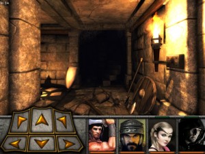
The Dungeon kings interface was in place for some weeks now. However i was far to be satisfied with it. Note that it’s about the TOUCH interface for mobile/tablets. The heroes panel was located at bottom of the screen. Nice for a panoramic view. However, there are two problems :
-DK has mainly indoors, so panoramic view is not so well suited. And also, panoramic/large view allow to see more things around, but the field of view’s “height” is reduced : you see smaller portion of the floor/ceil. Not so great as there are items or traps on the floor !
-Secondly, the game run on different devices and screen sizes. iPad has a screen ratio of 1.33 , iPhone 4/4S 1.5, iPhone 5/S/C, Nexus 7, LG G2 have a 1.7 ratio ! It brings problems when designing an interface based on screen width !
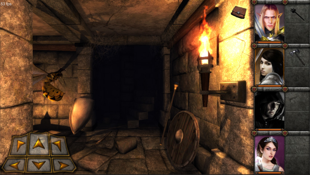
After struggling with the ergonomy, i decided to created a new playfield interface: portraits are now located on the right. Let’s see the new UI:
The red squares are actually replacing the green bars on the old interface, they are Magic and tireness indicators wich are glowing more or less according the value. Note that you can’t see on the screenshot, but items part is automatically scrolling out of screen when opening the inventory, leaving more room for 3d view and allowing drag and drop from 3d view to inventory slots. Also note that on desktop computers using mouse, you can both take item as cursor, or use drag’n drop like on touch devices ! And at last, the FOV and 3d viewport are being adjusted dynamically when the heroes panel and inventory panel are scrolling to keep a wider 3d view area when screen is partially filled by theses interfaces panels. The Arrow panel will disappear if using swip touch control mode for moving, and will be much more transparent in cursor keys mode.
After playing a while, i am now really satisfied with the current UI (user interface) layout. On small screens, i am planning to add button to automatically attack/switch heroes, making it easier to quickly attack on the small screens : hit the button, to launch an attack with curently selected hero, then after the attack is launched, the game will automatically switch to next hero, waiting for you to press again the button and repeating the process. Of course the game will decide wich hands / attack to launch for you. Keep in minds this is purely optional and targeted to small screens only.
I am finally glad i spent time to change the ui, and feel so motivated to go on creature fighting !!!
Compare the ui to old layout :
The new interface features much less lost in 3d viewport height, and more convenient to use for mobile device !
Now back to creature fighting !!


I prefer the interface or character are as low in dungeon but works fine anyway